


#042 Ten diagrams about AI
Cafe news / Time-lapse of my drawing
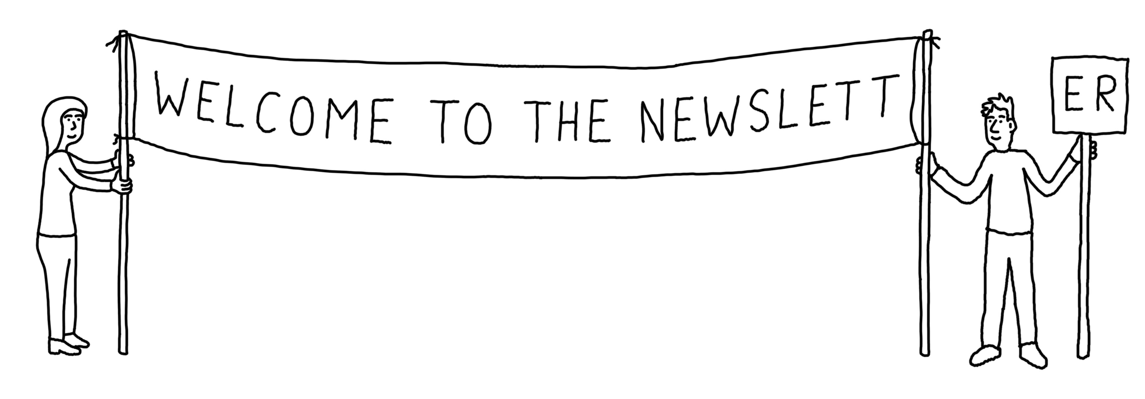
Hello, and welcome to Diagram Club number #042.
This week: Yes, I have drawn ten (10) diagrams about AI. This is unprecedented - to have drawn ten diagrams about anything in one go. Welcome to the new Era of Productivity*. There’s also in-depth Cafe news, for reasons that will become apparent.
*Eras come and go, eras can be brief, don’t pin all your hopes on any one era, etc.
But before we begin…
This newsletter is brought to you thanks to Diagram Club Paid members. Upgrading to the Paid means you get the extra content at the end of each newsletter, there’s things you can print, you can reuse my work in non-profit ways, and you’ll hear about what I’m doing before anyone else. This button is the path to all of that and more. Thank you!

Ten cartoons about AI
General comments: These are my opinions. Some of these are points I had planned to make in an article for a newspaper last year or so, but I found it too hard to write (sorry Vicky). Some the drawings are ‘best’, some are scribbles, and some aren’t drawings. I’ve written a brief line or two of commentary under each picture. Oh - AI stands for ‘Artificial Intelligence’ (I consider living under a rock a valid lifestyle choice). Thank you!
1.

I suppose this is one of the main problems I have with AI when used for images - the impact on the artists whose work the AI model has been trained on. It’s our work that’s being used, with no recompense. And our jobs being taken away.
2.

Misc ways to describe AI content - well, artwork at least. It’s everywhere, and it’s terrible. OK, so sometimes it’s ‘clever’, but lacks humanity.
3.

Second problem with AI - the environmental impact. Not really often considered or quantified. Tech companies are seeing their greenhouse gas emissions grow hugely at exactly the point we need to reduce them drastically and urgently. Ask a scientist (an actual one).
4.

If your newsletter / Facebook page / blog post / whatever is using AI art then, let’s face it, the text is probably AI too. I’d prefer to read things written by a human.
5.
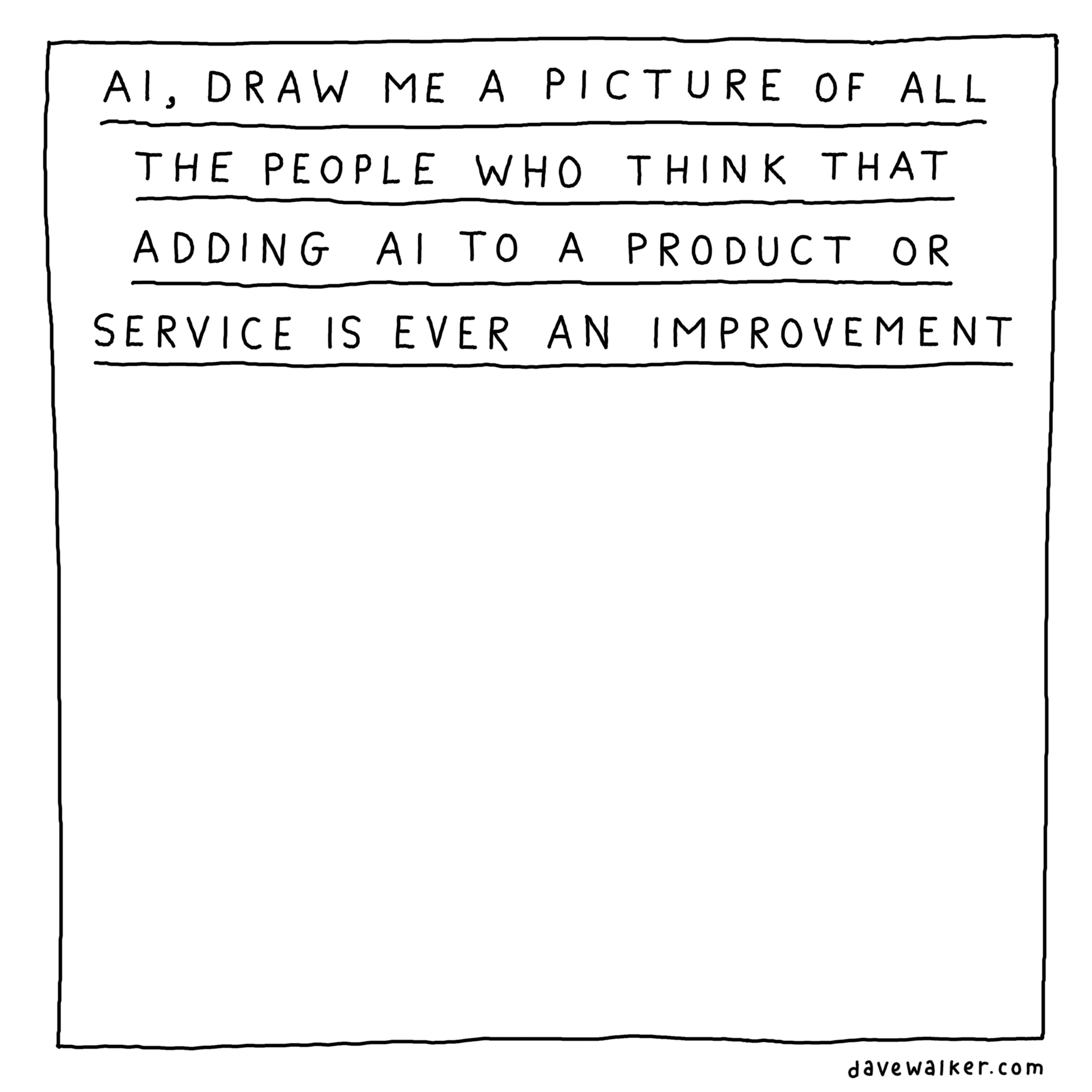
AI is being added to lots of digital products and services. Companies seem to think that is somehow an upgrade or improvement, but in my experience it never is.
6.
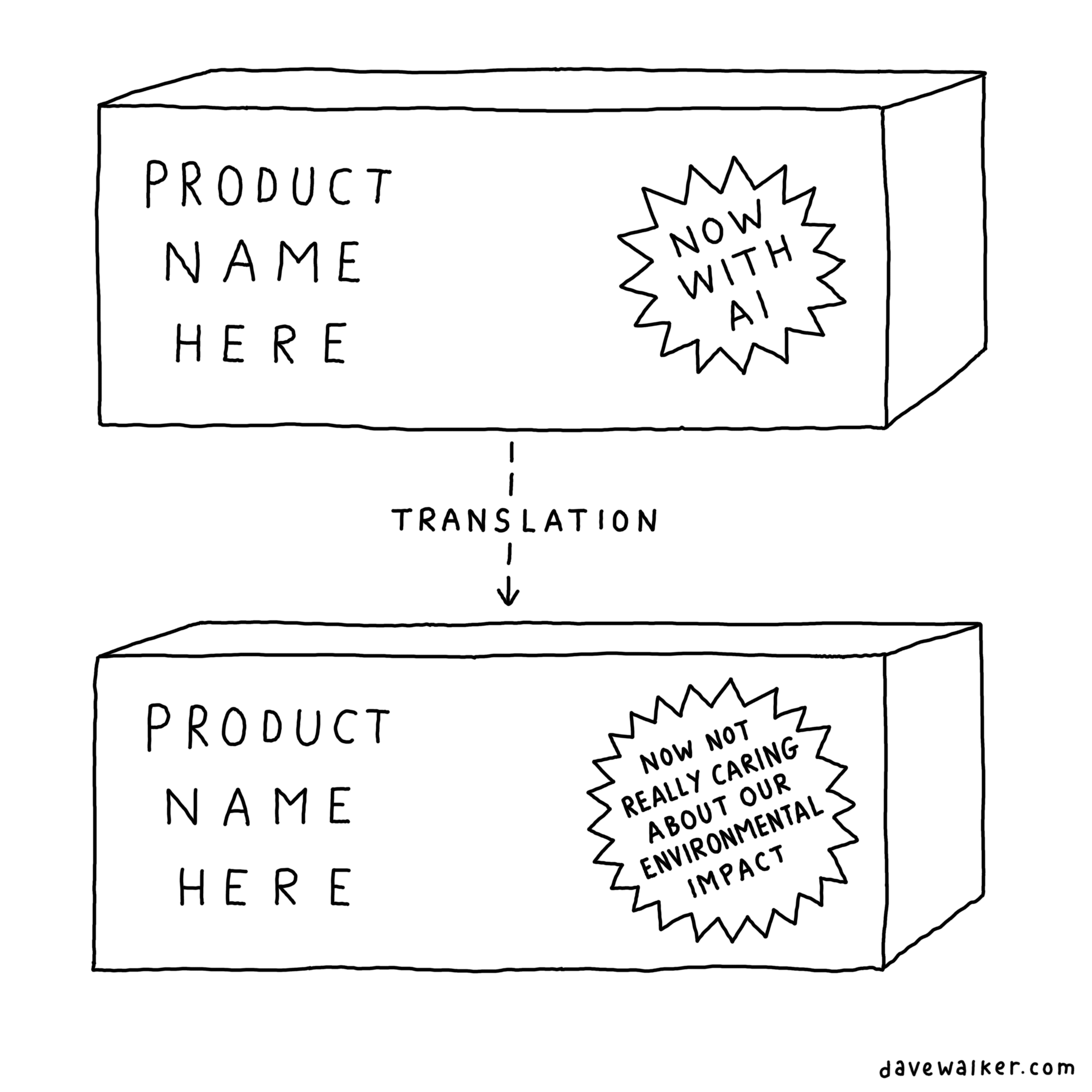
And then there’s the message it gives out about the company and the extent to which they actually care about their environmental impact.
7.

I’d prefer not to have AI overview as part of my search results. It means that we can’t really trust [OK, let’s name them] Google to be reliable any longer, as some of the sources they are using just aren’t very accurate. Please, let us decide which sources we want to get our information from.
Here’s a thought: use Ecosia. It’s a search engine with environmental credentials and no AI preview. Here’s how to switch your default search engine.
8.
[Spot the man who had 9 diagrams…
But, it’s true. You can make stuff. It doesn’t have to be perfect.]
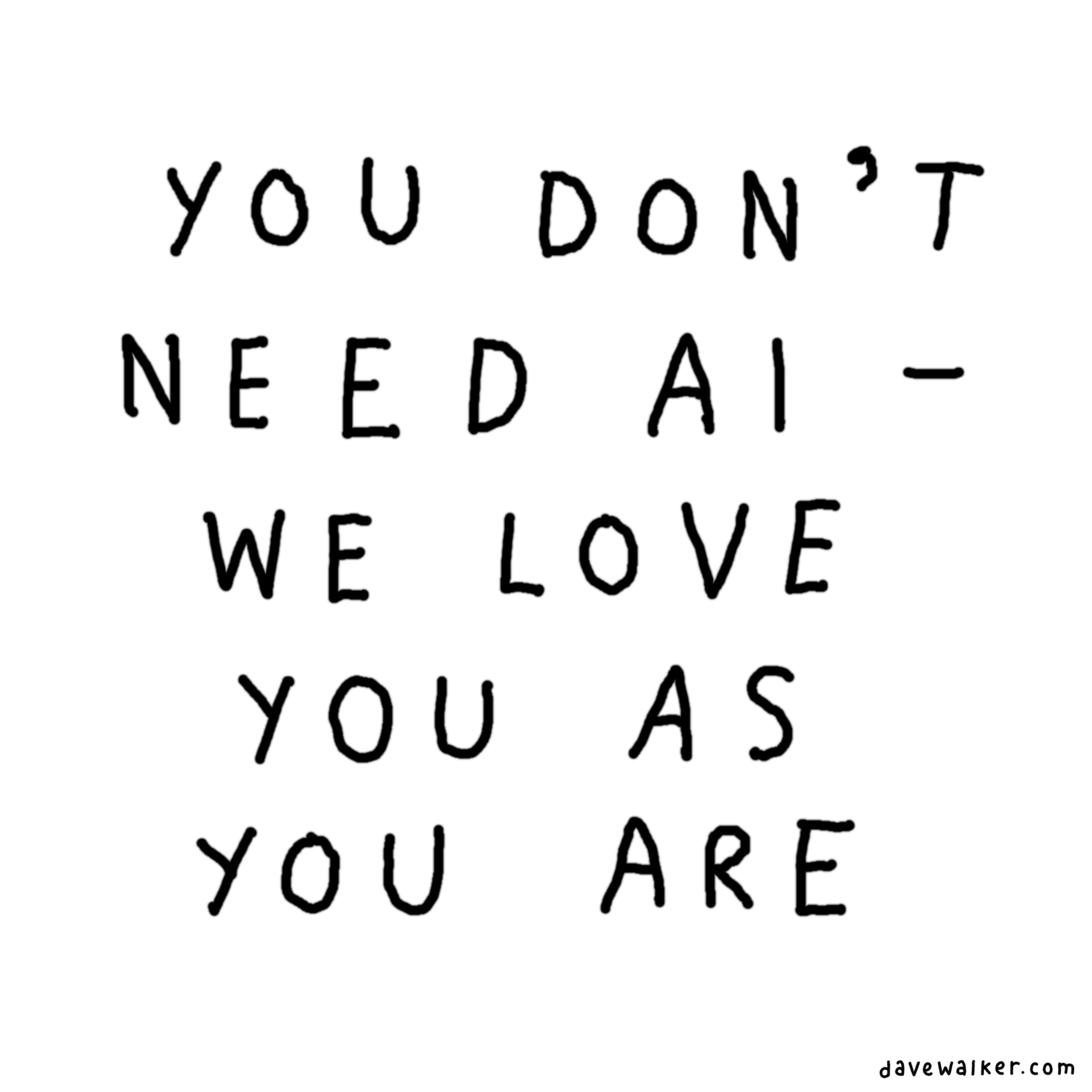
9.

I know there are lots of people doing very well from AI, unbothered by non-payment of artists, the environmental impact, etc, and if that’s you you won’t be caring what I think. Hello! I mean, thank you for reading this far, at least.
Are there valid uses for AI? I’m not ruling it out. But it’s not easy to think of many.
10.

We’ve hardly scratched the surface. There are lots more angles that could be considered, but I got the ‘Post too long for email’ message ages ago..
I’d like to hear your thoughts. Feel free to disagree. Let me know. You can reply to this email, or if you’re a Diagram Club Paid member you can comment on the Substack page for others to see.

Cafe News
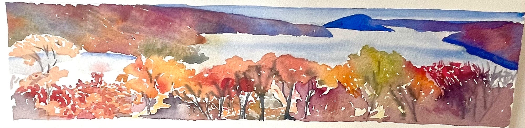
It was Jean’s funeral on Friday (see Diagram Club #039). It was, of course, a sad day, but good to remember Jean’s life and hear stories from those who had known her far longer than I had. The wonderful painting above is one of Jean’s, which was one of those on display at the Halfway House afterwards. Jean loved The Cafe, and so I’m going to tell you some of the other fun stuff that’s been going on as well, because she’d have enjoyed hearing about it.
I posted the walking and cycling map on local Facebook groups, and it went down well, which I was pleased about. Only one person said, of my black and white work, ‘Colour please’.
I did some actual volunteering. Yes, I know. Making things on the shelves in the shop look lined-up but but jaunty, learning about the new
binocli…binoculars, organising the optics stock, and setting up a little exhibition of work by the Lovely Art Group for the day of Jean’s funeral. If this all seems like I’m blowing my own trumpet, which it might, please know that I continue to receive far more than I give.A presentation of a box of Redbush tea was made to the staff for the staff kitchen. The ceremony was brief and to-the-point. Please don’t think that this donation was largely for my own benefit, by the way.
We’ve got ducks. Sue has been wrangling them, which I think is the term used within the duck-herding community.
[Background info / short advertisement: ‘The Cafe’ is Langdon Nature Discovery Park, an Essex Wildlife Trust centre. Why not consider visiting your local Wildlife Trust or other nature reserve? They probably won’t serve Redbush tea, but in every other regard it will be excellent.]
Brief ecclesiastical cartoon update
Off-topic but becoming a weekly feature, as some of you like to know what else I’m doing.
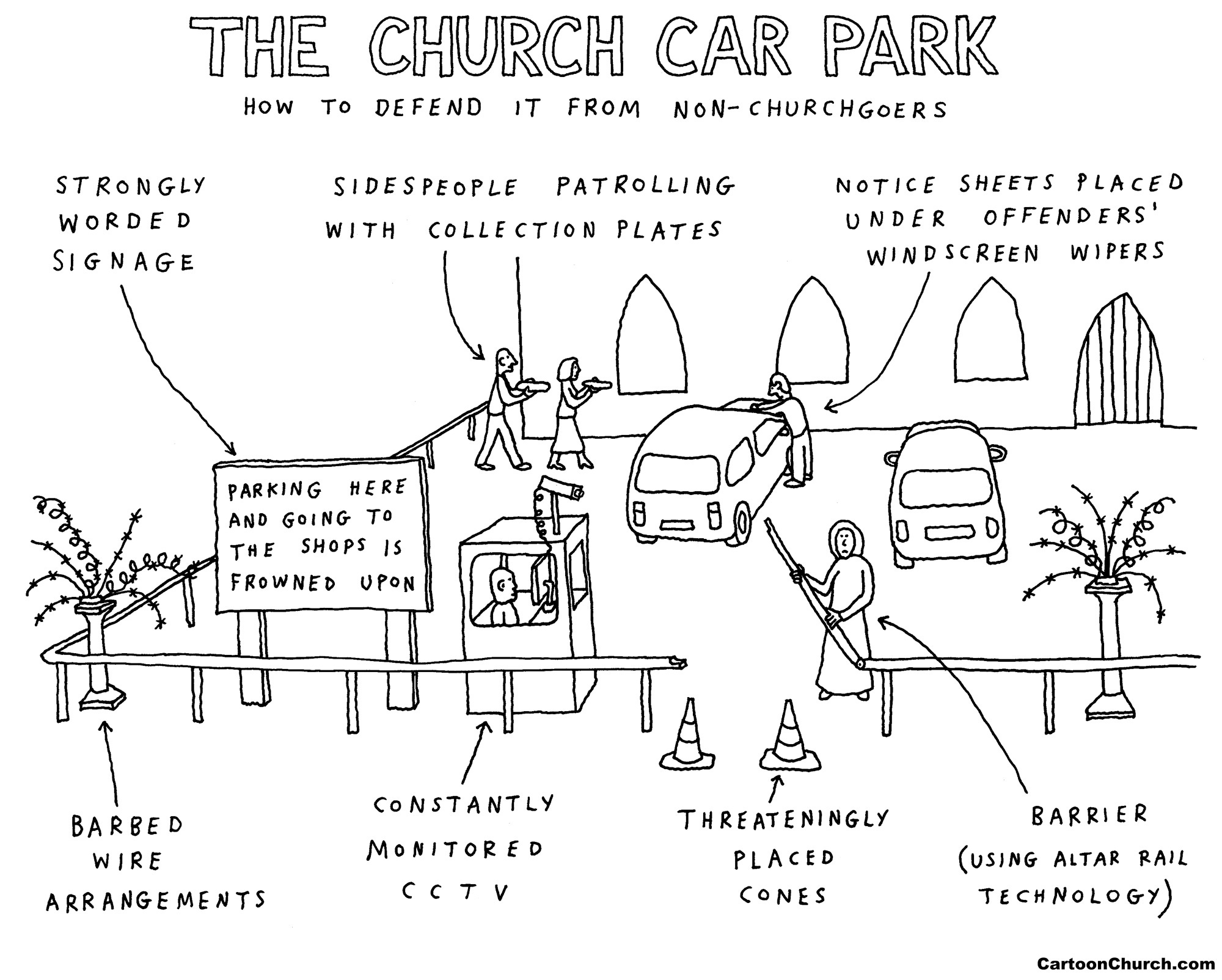
This diagram was posted on the Facebook page for my church cartoons this week. You can follow for regular updates, thanks to my excellent team having returned, some while ago now, from transatlantic travels.
Colour of the week (filler) and concluding comments
It has to be pink this week, Jean’s favourite colour.
Thank you for reading. There’s more for Diagram Club Paid members below The Orange Line. This week: Want to see how I draw my drawings? There’s a time-lapse video of the drawing of AI diagram no 1, ‘The artists whose work was used…’. Which word did I decide to leave out to tone it down a bit? Which word did I misspell? All this, and more.
See you soon for episode number #043.
Dave
—
It’s an advert, but a brief one
If you’d like to support what I do, one of my two subscriptions is a great way:
Diagram Club Paid. The paid upgrade to this newsletter. Click this button:
CartoonChurch licence - for republication of my church-themed cartoons in church magazines, etc. Details here.
Thank you!
Keep reading with a 7-day free trial
Subscribe to Diagram Club to keep reading this post and get 7 days of free access to the full post archives.